Red Bull Phase Rush Energizing the Gaming Community
Creating a fresh, and visually unique experience while aligning the design with values and an identify of a established brand like Red Bull.
Bridging Brands and Gamers
Red Bull, a brand synonymous with energy and extreme sports, sought to expand its presence in the gaming world. The challenge was to create a gateway between the Red Bull brand and the challengerproject.gg gaming platform while maintaining the essence of both entities.

Blending Energy with Pixels
Collaborating with a large brand on a tight deadline required us to deliver a fresh experience that aligned with Red Bull's brand values and resonated with the gaming community, while maintaining a visual style that was distinct yet unmistakably Red Bull.

.avif)
Final stage of Red Bull Phase Rush 2023, Photos © Bartek Woliński
.avif)
The target demographic of 18 to 35 years old gamers needed the user flow remained quick and intuitive, as the website served as a gateway between Red Bull, challengerproject.gg and the actual game of League of Legends.
"The challenge in creating a site for an event like this is that no user wants to take anytime whatsoever learning how it works. They just want to game."
- On why it was essential to build a seamless expirance


The event went on for 4 weeks. Each week unlocking three more, diverse challenges to keep users engaged and for them to test their gaming skills in.


Asynchronous Challenges
The platform hosted asynchronous competitions with two main reward structures:
- Weekly Rewards: Users competed for prizes such as Red Bull cans or sponsor-provided items.
- Grand Prize: Top performers earned the opportunity to join their team captain on the main stage during the Red Bull Phase Rush finale.
This structure allowed for ongoing engagement through regular rewards while also providing a significant aspirational goal for highly motivated participants.

Diving into the Red Bull Universe
Methodology

Studied current Red Bull design standards
This was essential in meeting the required timeframe of the project.

Analysed Red Bull's brand values
We needed to make sure that the user experience aligns with the core values of Red Bull.

Reviewed previous Red Bull collaborations
Exploring previous collaborations provided us with insights as to what is possible and what's not allowed.
"One of the major challenges of the project was the need to work in a restrictive time frame. I knew that to get the job done the number of revisions had to be kept to minimum. That's where the early focus on aligning our design with the Red Bull brand came from."
- About the direction and the constraints of the design

Sources:
https://www.dayy.de/project/the-new-red-bull
https://www.redbullshopus.com/pages/style-guide
Internal Red Bull Documents
Red Bull Core Values
Research and internal communication uncovered that the most relevant brand values to our work were:
- Energy, Adventure, and Pushing Limits: Red Bull's brand identity revolves around high energy, extreme sports, and encouraging people to push their boundaries
- Community and Engagement: Through sponsorships, events, and content creation, Red Bull fosters a sense of community among its target audience
- Innovation and Creativity: Red Bull encourages an innovative and creative mindset among its workforce and in its marketing strategies
Sources:
https://businessmodelanalyst.com/red-bull-mission-and-vision-statement/
https://www.astrogrowth.com/blog/red-bull/
Internal Red Bull Documents
Previous Red Bull Collaborations


In addition to the design specs received, an overview of previous Red Bull collaborations and events helped identify common elements and visual components commonly used throughout the brand's lifetime.
Key Insights

Red Bull allows for creative freedom within their visual identity
We found a diverse range of approaches and visual expressions in previous collaborations and events of the brand.

The core brand essence must remain intact
Whatever the project is, it still has to always read as Red Bull. There's many approaches for this, but for us we decided that it will be best if we keep interface components such as buttons and calendar cards align with the general Red Bull system. We also drew inspiration from the classic icon that is the Red Bull can.

Gaming-related Red Bull events have a distinct visual style
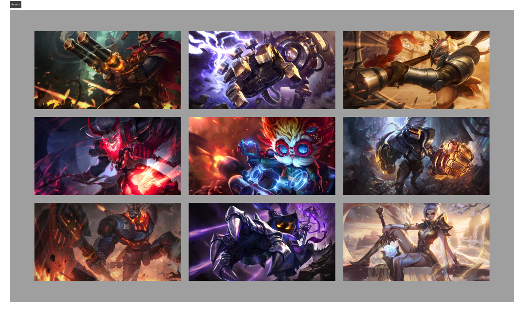
Across all gaming-related Red Bull projects and events we noticed a trend. Usage of bright neon-like colours and bold visuals. This aligned perfectly with our brief and the graphical elements received.
Crafting the Experience


Incorporating the Gaming Aesthetic


Creating a Seamless User Experience
To create a seamless expirance we kept the number of features to the bare minimum and Combined the event and site registration into one, this ensured that:
- New users already were set up with an account by the time they visited our service for the first time
- Already active users didn't need to go through the process of creating another account
- Calculating scores and completions of challenges would be as streamlined as possible
Iterative Refinement

Fine-tuned the capitan selection for maximum impact
Selecting the Capitan of your team was a key selling point in the social media communication for the event. Because of it we, together with Red Bull decided to tune this moment in the UI.

Made adjustments based on user analytics
The userflow worked great for people coming over from Red Bull's channels. However this has left our own users a bit confused. We notice a podatnego of users who joined the challenges on site but didn't sign up for the event

Resolved content sizing issues
We had a delay between building the core of the site and getting the final copy delivered. As a result some UI elements had to be adjusted to accommodate more text.

Addressing the Core Userbase
"We noticed a percentage of the users who were joining the challenges but didn't join the event. With an implementation of the in‑system banner we saw that number plummet."
- About the in‑system banner

Displaying only for the eligible users (the ones based in Poland) the banner helped guide users who didn't come into the event through Red Bull's channels to the event site.
Note: I was not the designer responsible for the visuals of challengerproject.gg

A High-Octane Success

Successful event launch
We were fully able to deliver the event on time with minimal revisions. The event lunched on 9th of November without any hiccups, full capable to handle all it's participants.

Thousands of satisfied gamers
We processed thousands of users without hiccups. All participants were able to compete for prizes and a chance to stand on the big stage during the finale of the event without obstacles (other than getting enough triple kills to qualify of course)

Significant social media buzz
A significant rise in interest and attention around Challenger Project wan noted during and after the event. Gaining thousands of new users and noting a rising trend of user registrations after. The event even got featured on the League of Legends game launcher.

The launcher for League of Legends showcasing the event (Poland only)
Created a replicable model for future brand-gaming collaborations
The event wasn't just the registrations, active users and conversations that it led to. Maybe even more significant was that it served as a signal to other brands that Challenger Project is ready for big collaborations and big events.
Lessons Learned

Rapid design and development processes for tight deadlines
Speed was of an esmance in this project and it thought me greater need for building components that are flexible to content but also better communicating the constrictions of design.

Balancing brand identity with creative innovation
The visual design was all about blending excitement and the established brand identity. It thought me a lot about how to handle that balance.

Adapting system components to align with established brand identities
Ultimately the design was based on both the components typical to Red Bull and components of the Challenger Project system. Styling and applying them just right to create a design that both works great and looks great.


